Rijksmuseum
Shopper Print
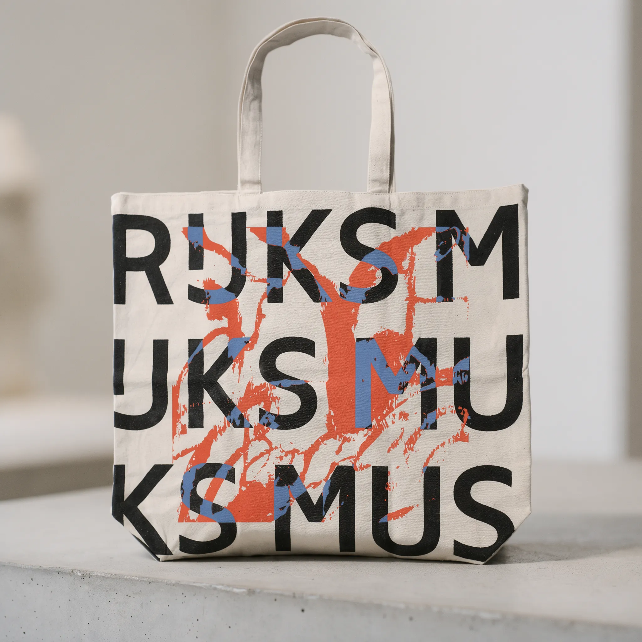
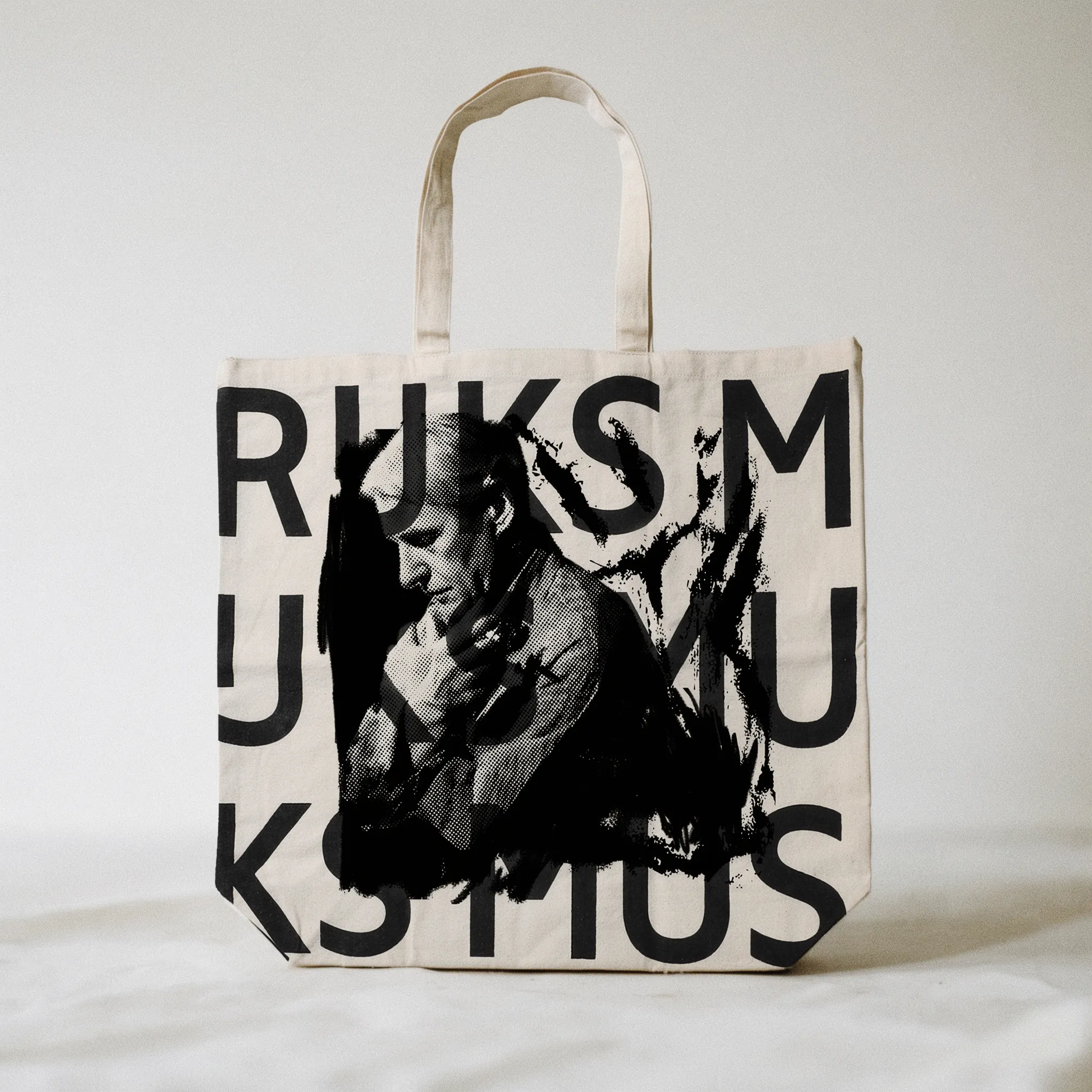
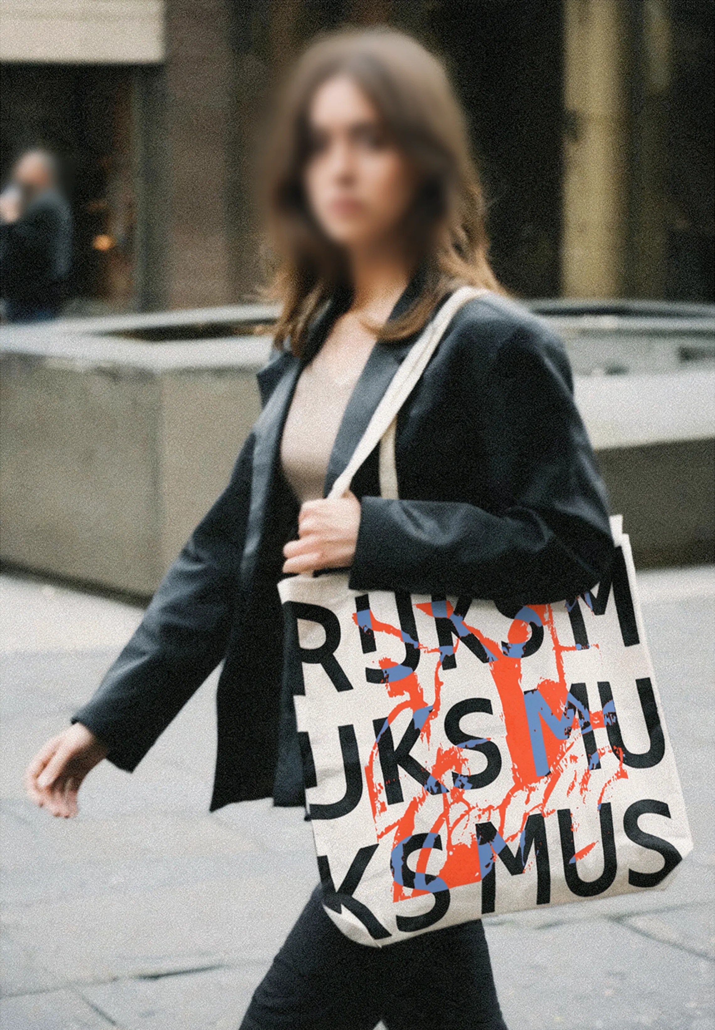
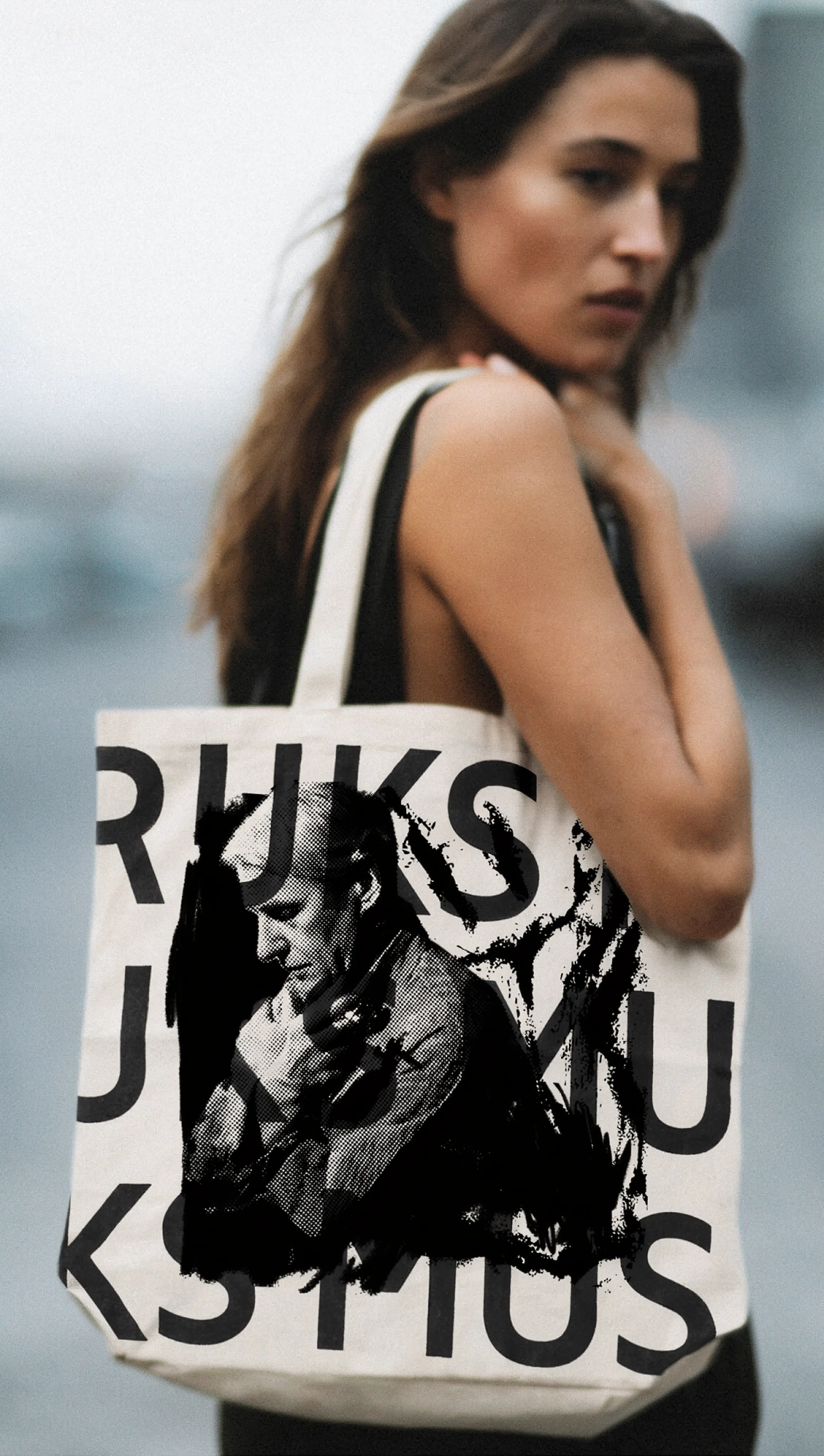
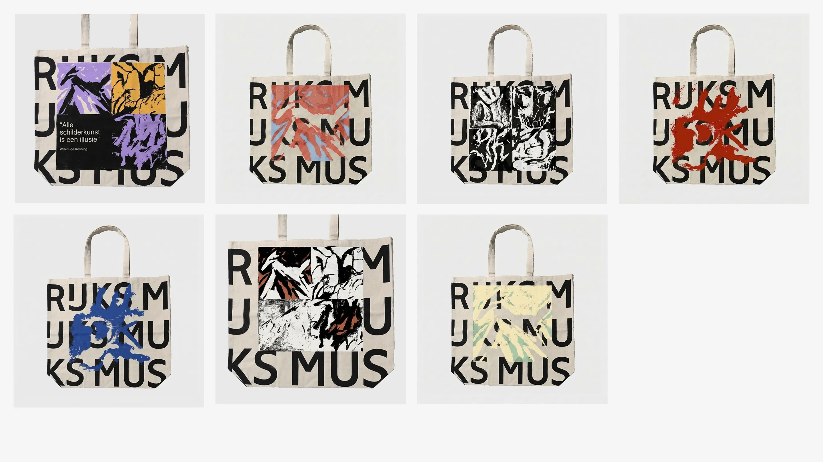
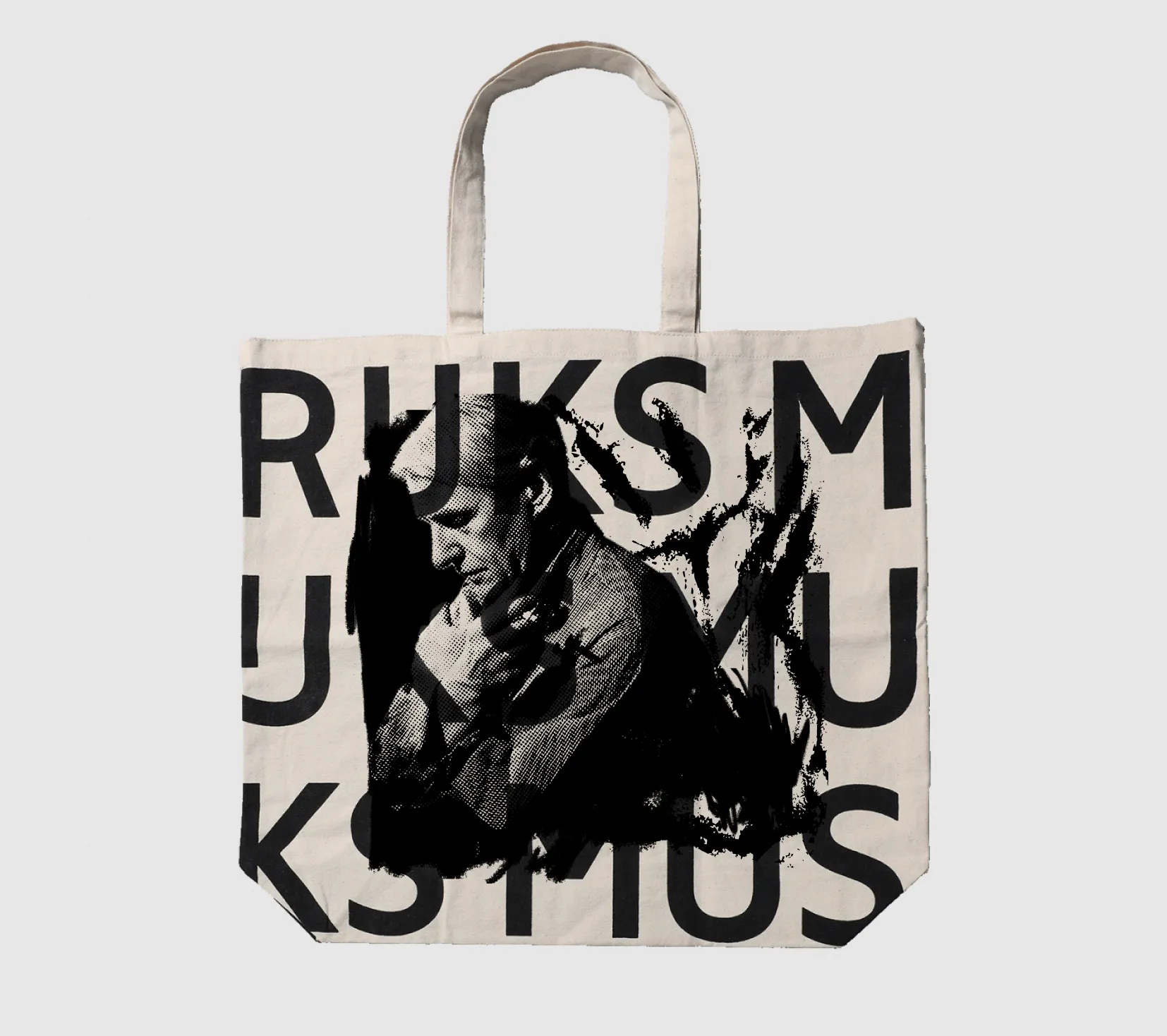
Winning museum merch proposal for Rijksmuseum, translating Willem de Kooning's restless visual language into a bold shopper print.
Rijksmuseum / Graphic design
Context
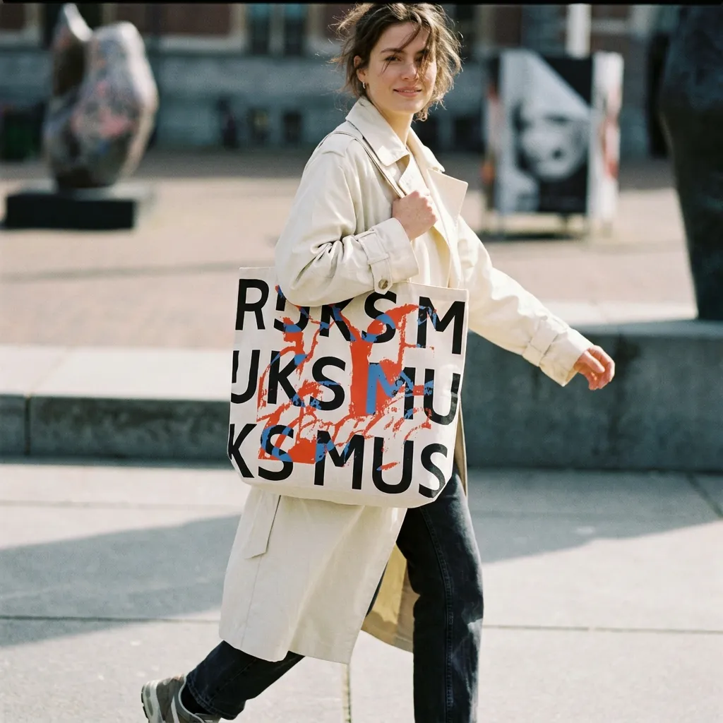
Rijksmuseum was preparing an exhibition around Willem de Kooning and needed a merchandise proposal that could translate the energy of the exhibition into an object visitors would actually use.
The brief was to create a print for a museum shopper: something functional, collectible, and visually connected to de Kooning's expressive forms without turning the artwork into a direct reproduction.
Design process
I explored three possible approaches. The first was about finding beauty in the ordinary: inspired by the unexpected marks left by steam on a takeaway food container. By rotating and transforming the image, I started to discover hidden symbols and forms inside the pattern, including the initials "WDK."
The second approach came through painting. I started with a few brushstrokes, searching for the essence of a horse rather than its exact appearance. As the marks developed, other images appeared: landscapes, tree trunks, figures, and abstract forms. The work became less about depicting a horse and more about how one simple gesture can turn into multiple readings.
How can an artist be original if art is an endless process of imitation, a series of small modifications to what has already been done? According to de Kooning, the answer is sincerity and humility. An artist renews art through honest self-expression while recognizing that artists are always part of something larger: a community, a history, a movement. In other words, nothing an artist creates is created entirely alone.
Here I combined my draft landscape with Endless Painting to create a stronger connection with the subject matter and make the reference more explicit.
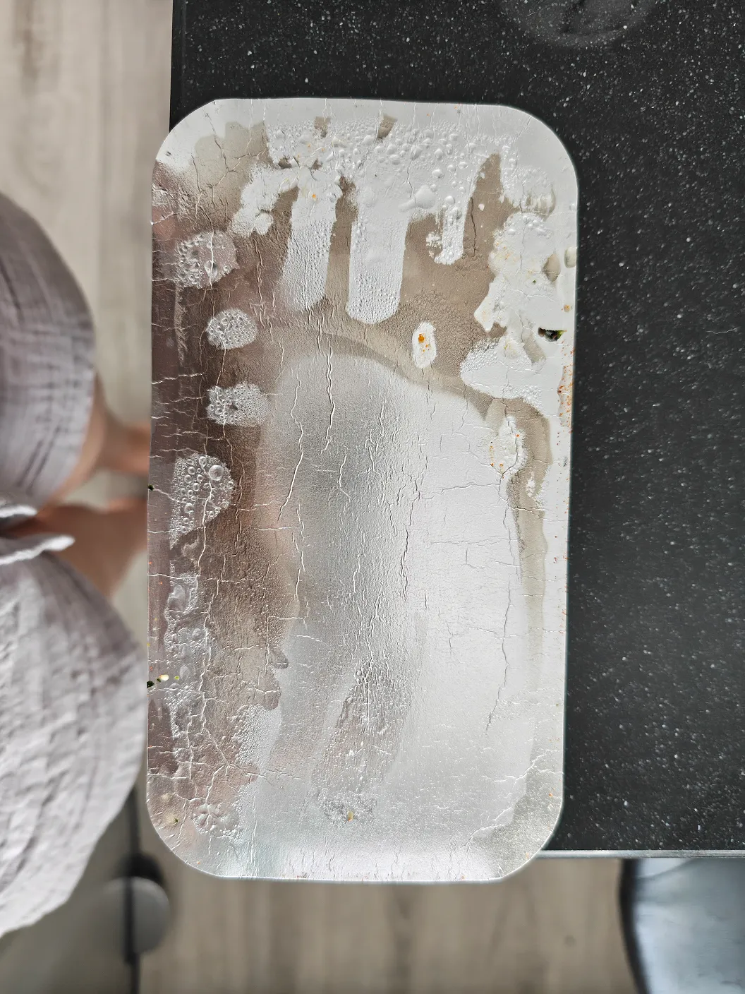
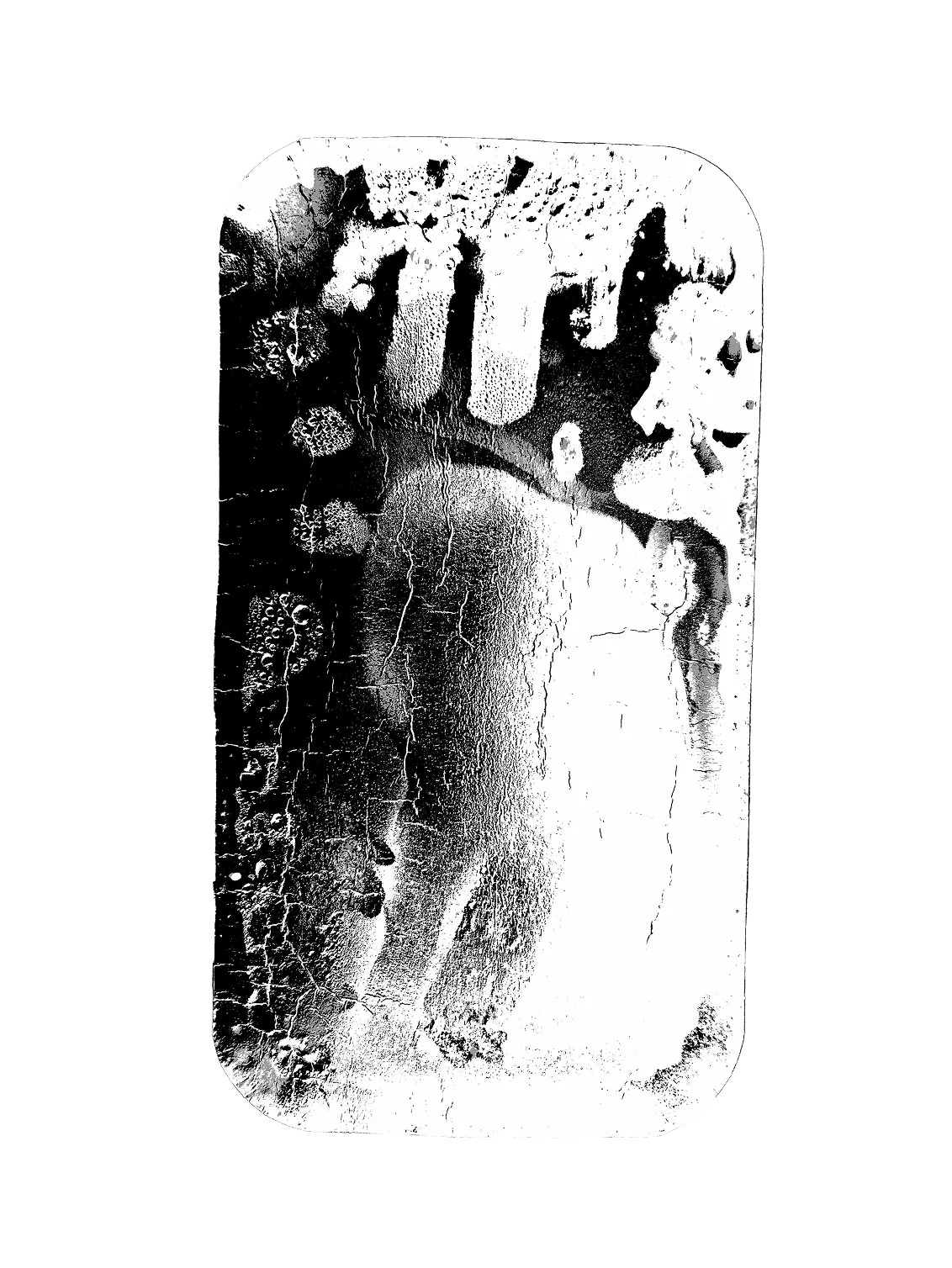
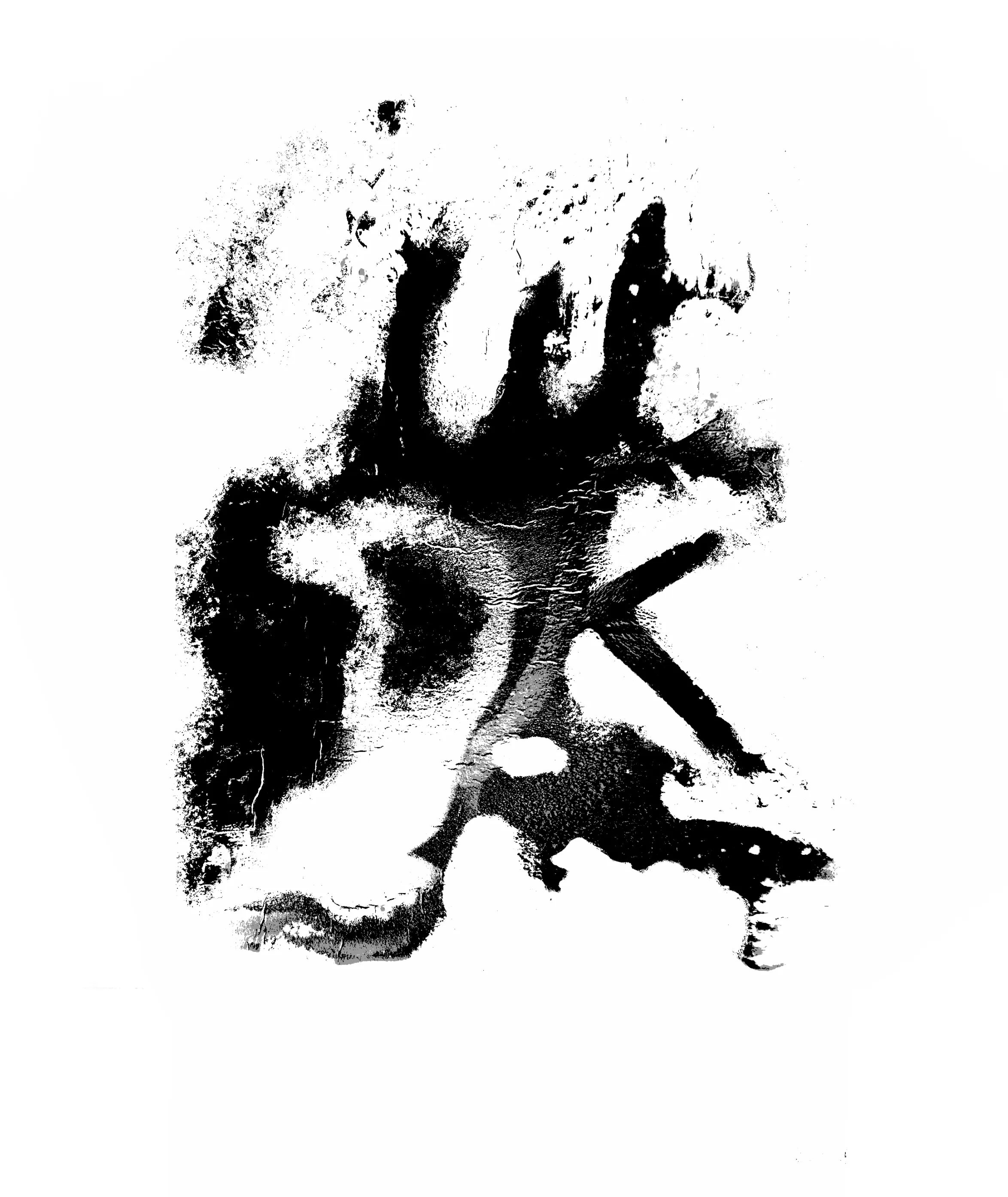
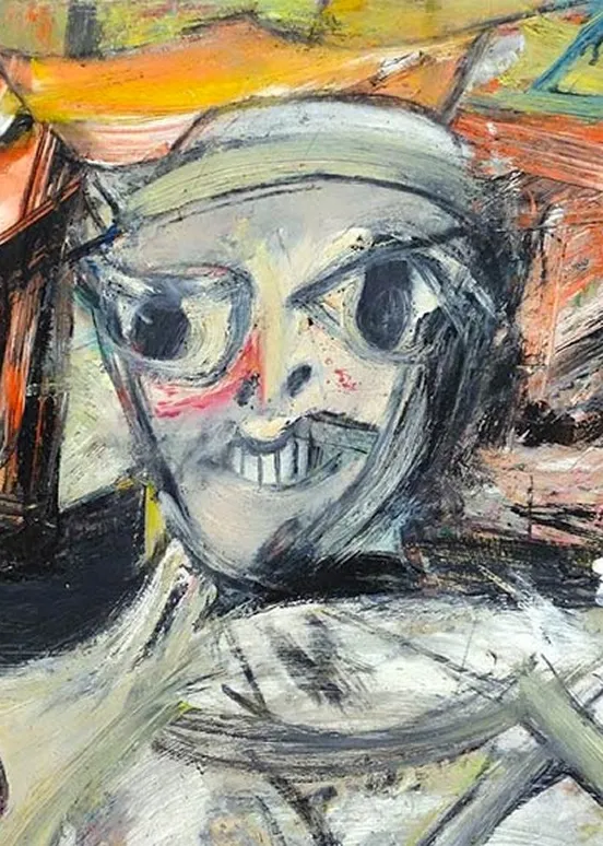
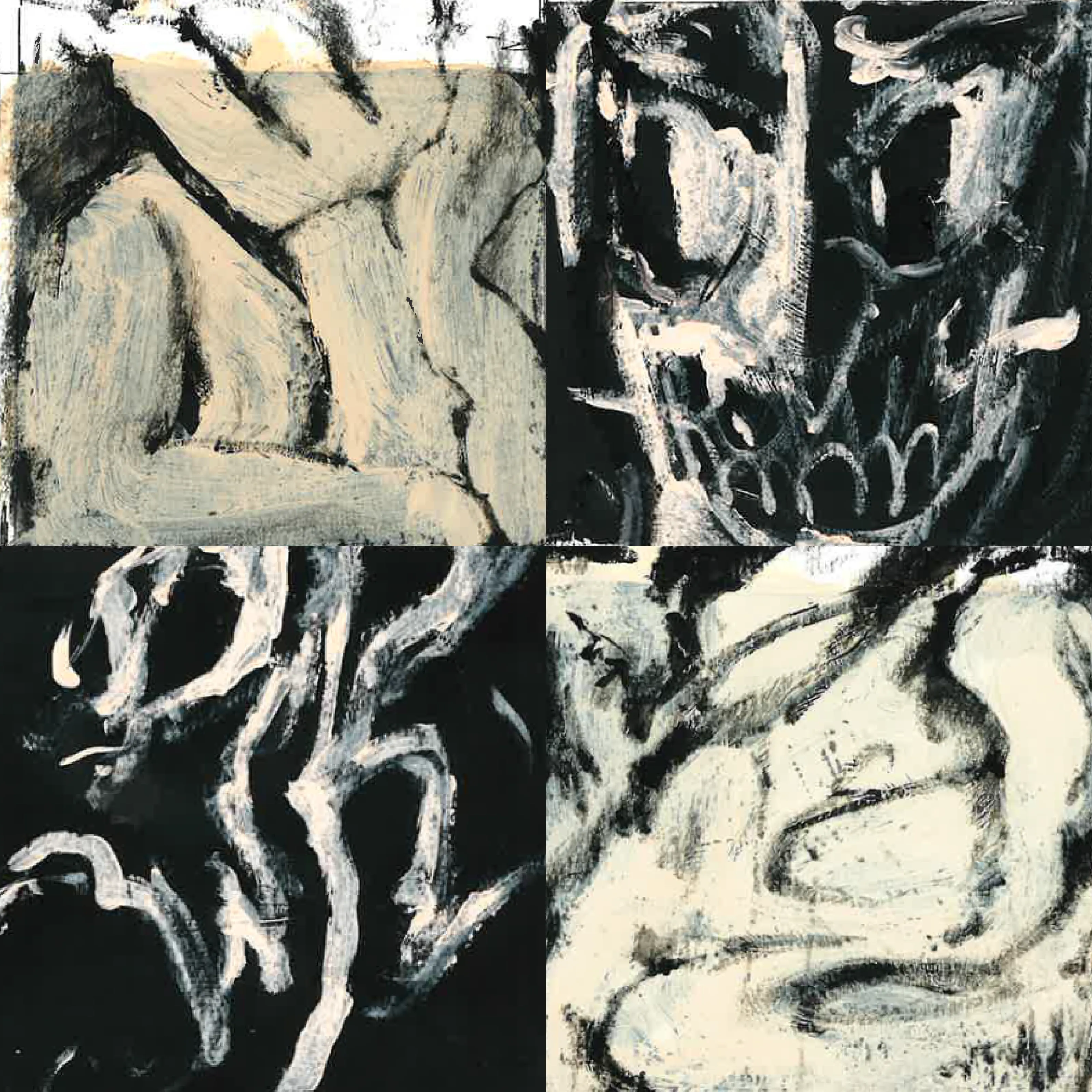
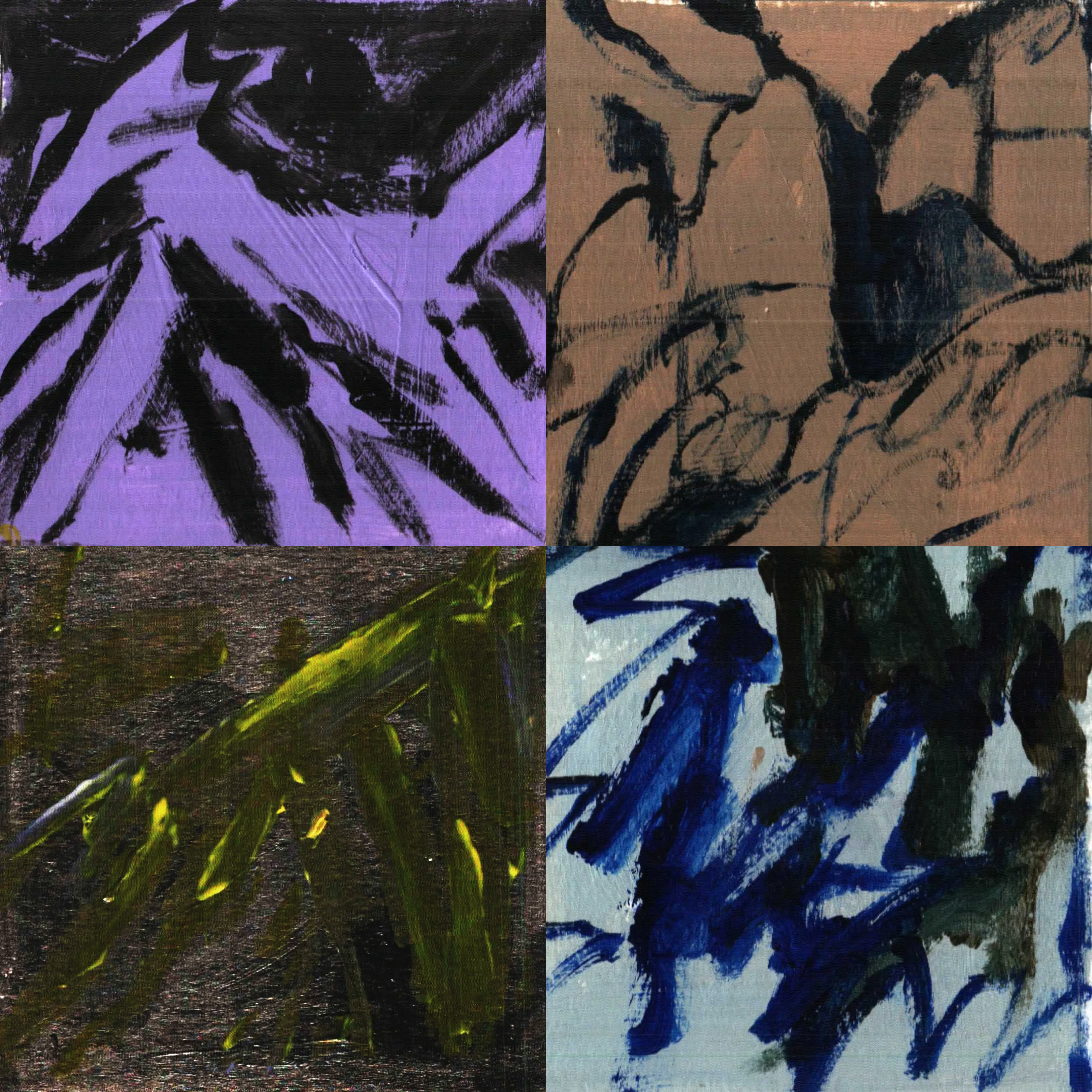
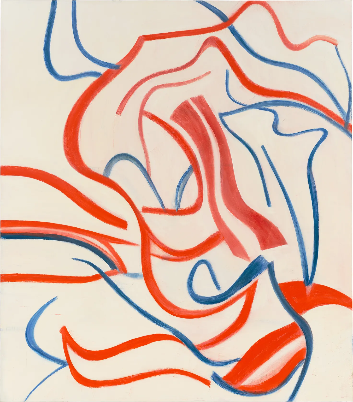
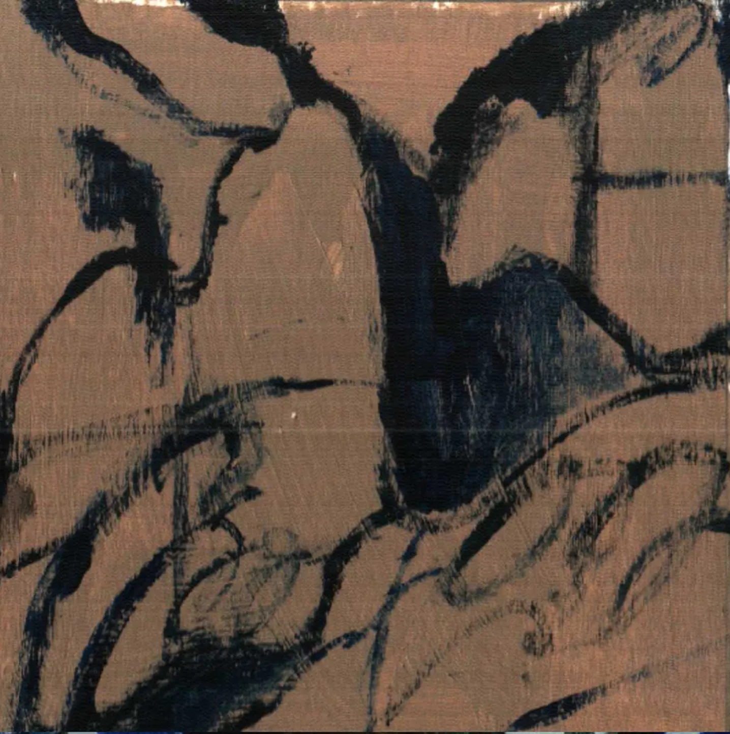
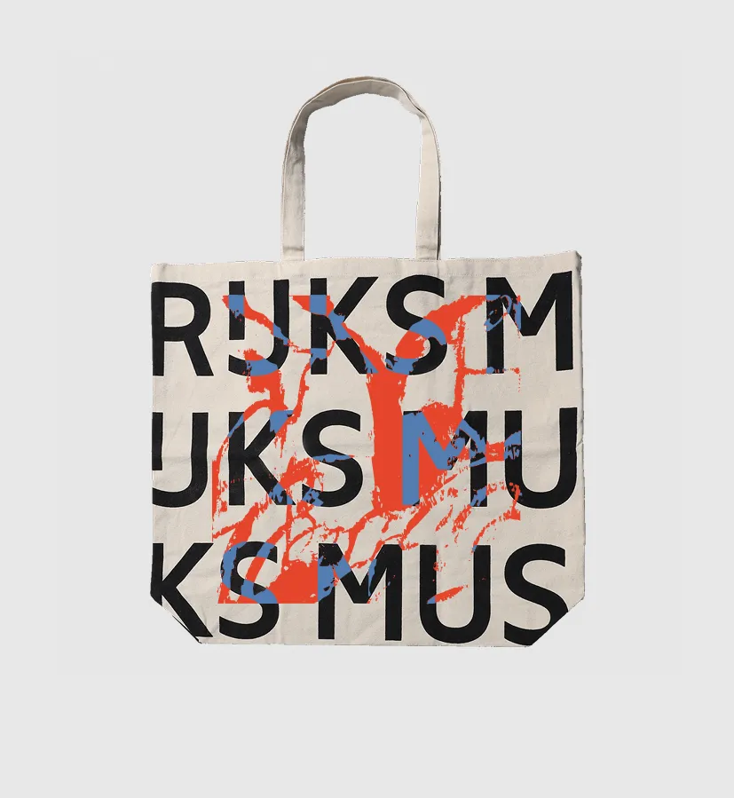
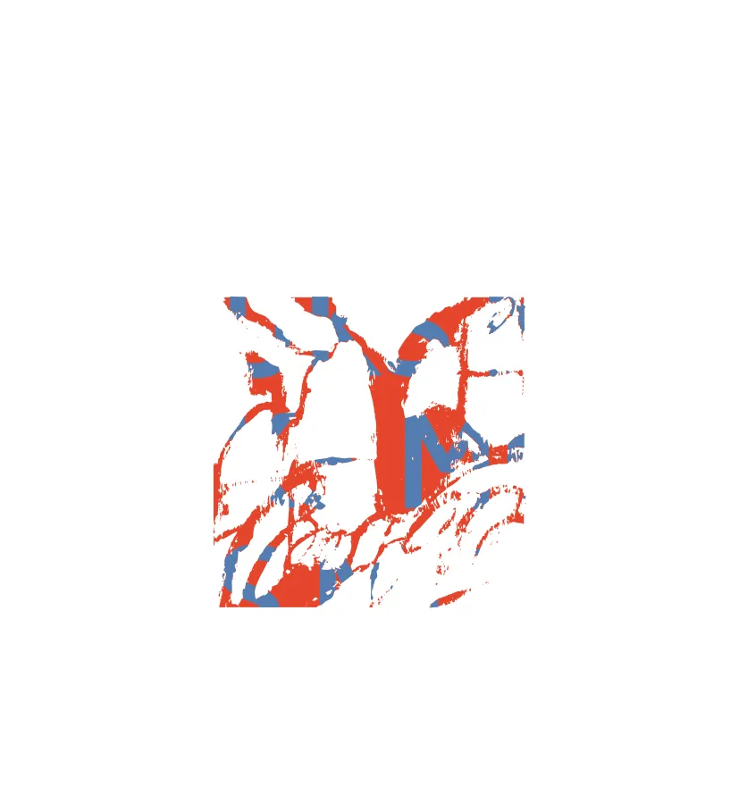
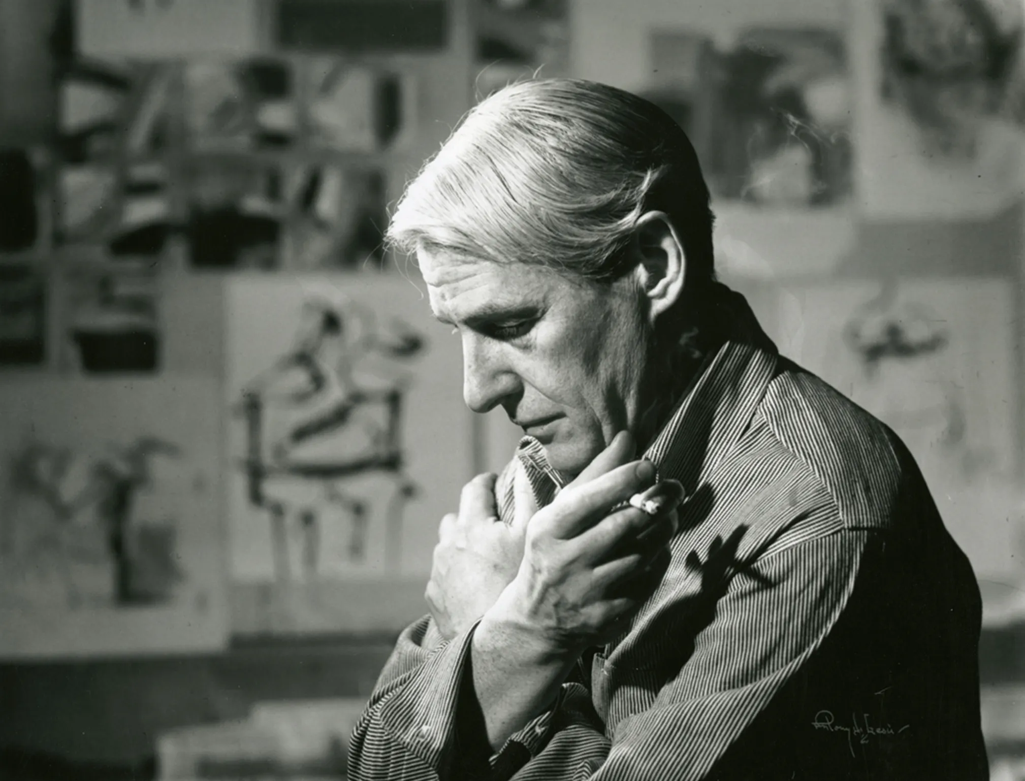
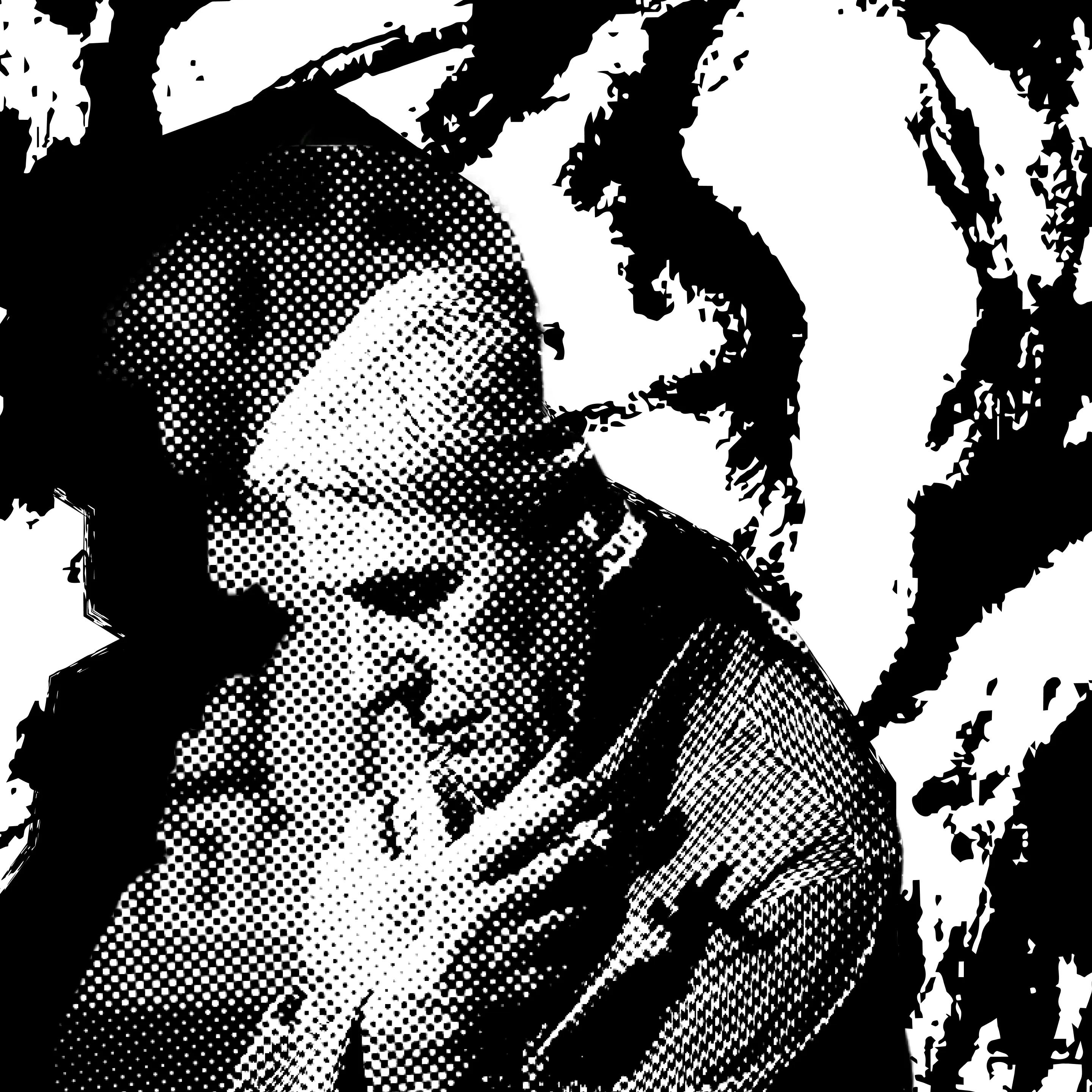
For the fourth direction, I combined the previous painting with a famous photograph of de Kooning, one everyone at WdKA seems to know. The black-and-white image helped create a more melancholic, introspective mood: a dialogue between the artist, his work, and the emotional landscape it came from.
Selected outputs